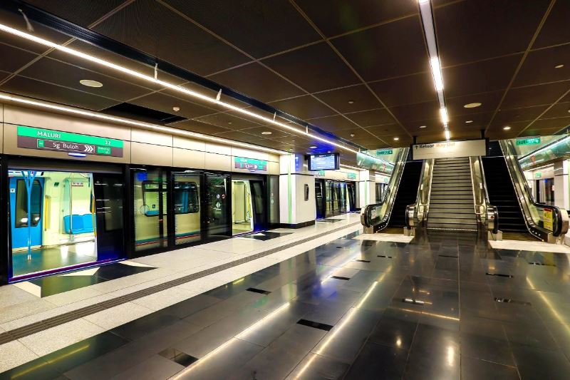
The MRT is our newest railway system to date, and its equipped with plenty of screens for all the necessary information we need. Twitter user @tenoq decided to play around with the designs a little bit to make it more user-friendly.
I got annoyed looking at the PIDS design so I decided to take a stab at it myself. Maybe I'll add a couple more variants for PSAs and advertising. pic.twitter.com/SWkGKsQBE5
— Fazri 🇲🇾 (@tenoq) August 26, 2019
And finally, the first display you see as you walk into the station. You can charge a lot of money for advertising on this screen. pic.twitter.com/hi0PXob3IK
— Fazri 🇲🇾 (@tenoq) August 27, 2019
Advertisement
He inverted the colour of the display screens and updated the layout, effectively clearing up the space and making information easier to see. He also took the time to add on advertising and PSA variants, with a bigger clock to ease visibility as well. Among the other suggestions made was for a news ticker to be added on instead of looped advertisements. He even enhanced the existing platform screens with bolder text and better contrast. Not missing out on the opportunity for advertising, Fazri edited the display screen that greets visitors at the entrance. Instead of taking up the whole screen for information, he changed the layout so that there would be space for advertisements, which is a great idea to pull in revenue.
I hope @MRTMalaysia sees this and hire you
— Ratu Rimba (@natashazlkh) August 27, 2019
Responses to the designs have been nothing but positive so far and netizens responded saying they hoped MRT Malaysia would hire him or at least consider his suggestions. As a frequent MRT user myself, I personally think these changes would make a whole world of difference and make the user experience a whole lot better. The littlest things really do make a change.
What are your thoughts?